I wanted a public artifact of how I think about systems: tokens first, a small component set with real states, and the same names in Figma and in CSS. At TINQIN I built a 30+ component library for product teams; that work stays internal. Andromeda is the method I can show — not a replacement for that system.
Tokens first, then Figma, then code, then the example site. I looked at how Carbon, Material, and Atlassian structure tokens and docs, then kept the scope to a core set I could finish with 1:1 naming between design and CSS.
Root (primitives), semantic (meaning), and component (usage). Dark mode is a semantic remap, not a second palette glued on later.
Variants, auto-layout, and variables. Usage and accessibility notes live on the components, not in a separate dump.
Same token and component names as Figma. States include hover, disabled, and error where they belong. Contrast checked against WCAG AA on the core set.
Foundations and component pages with copy-paste markup, used to see whether the tokens actually hold up in a layout.
Components never pick a raw hex. They use semantic tokens, which point at root scales. Changing a theme means remapping semantics, not hunting through every button.
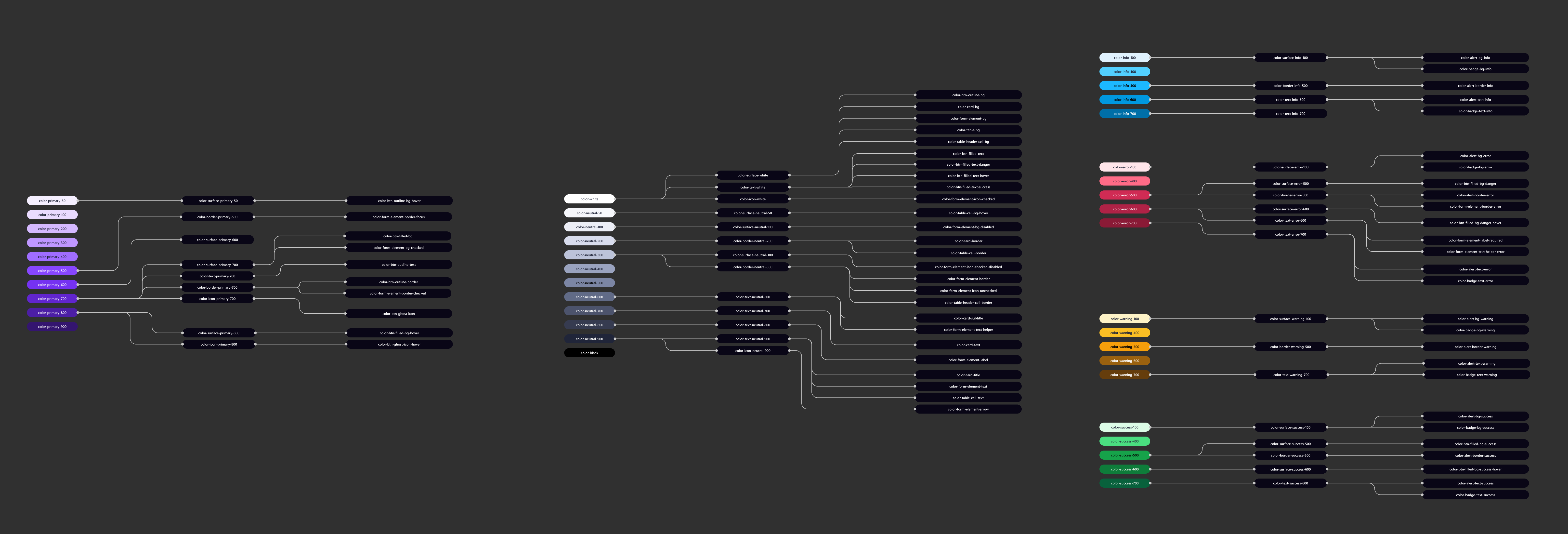
Root → semantic → component. Theme changes at the semantic layer.
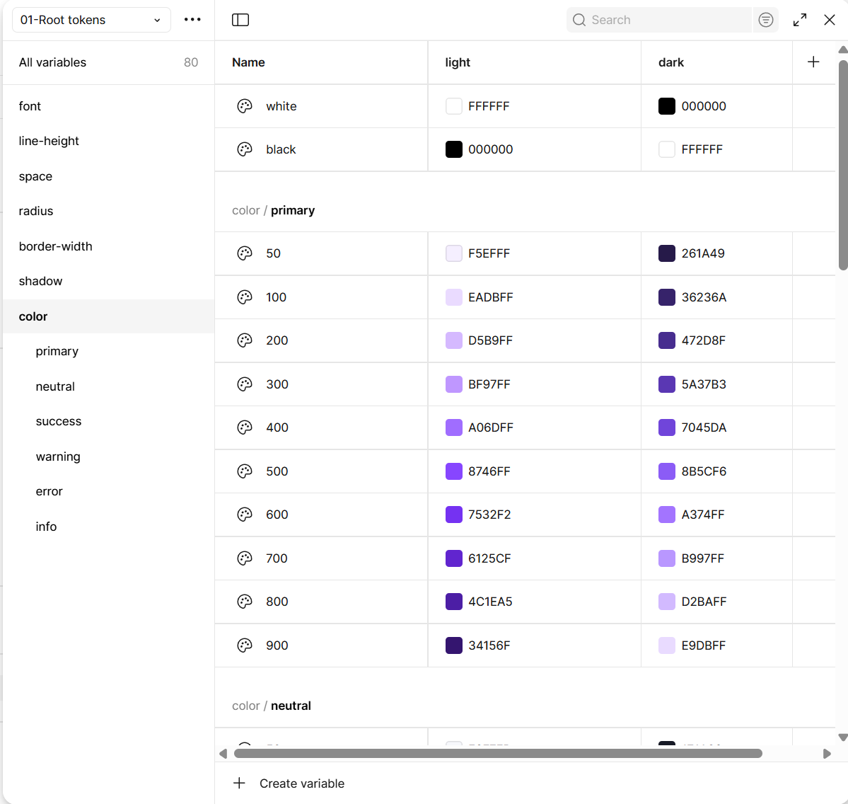
Root — primitives
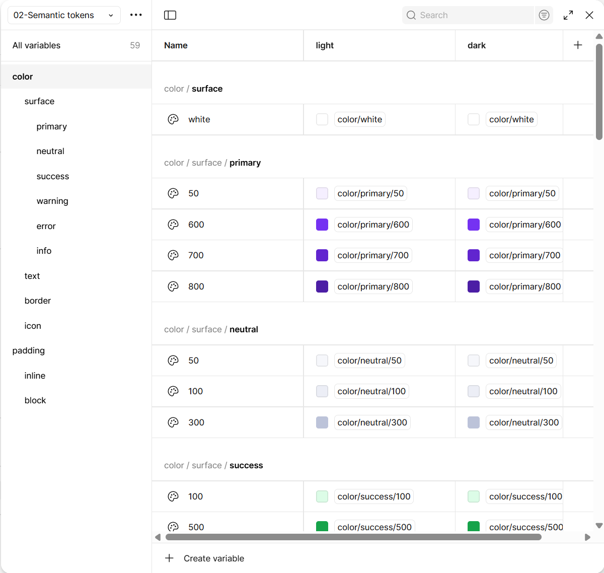
Semantic — meaning
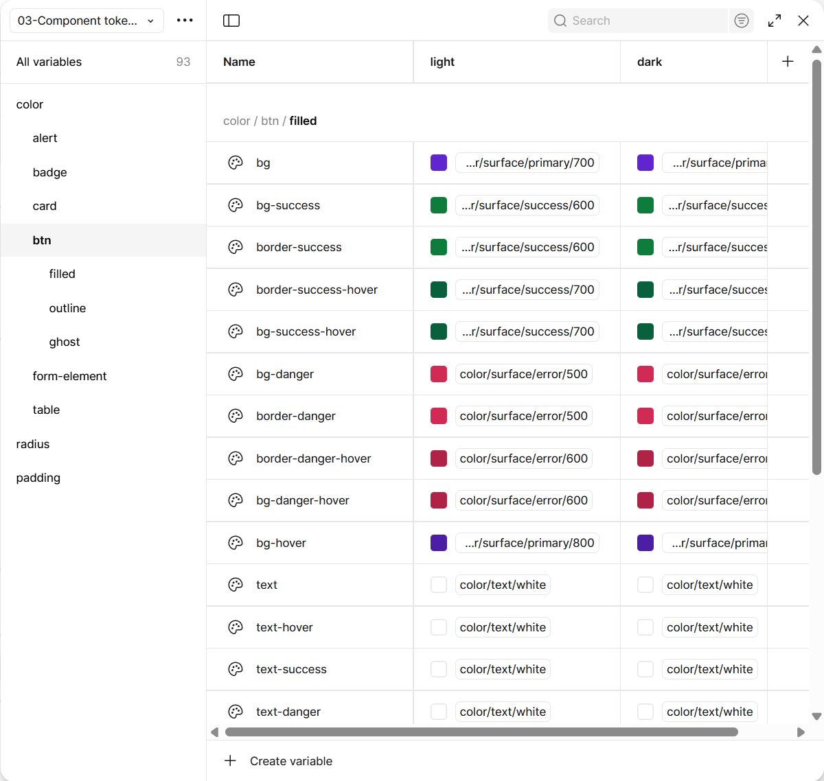
Component — usage
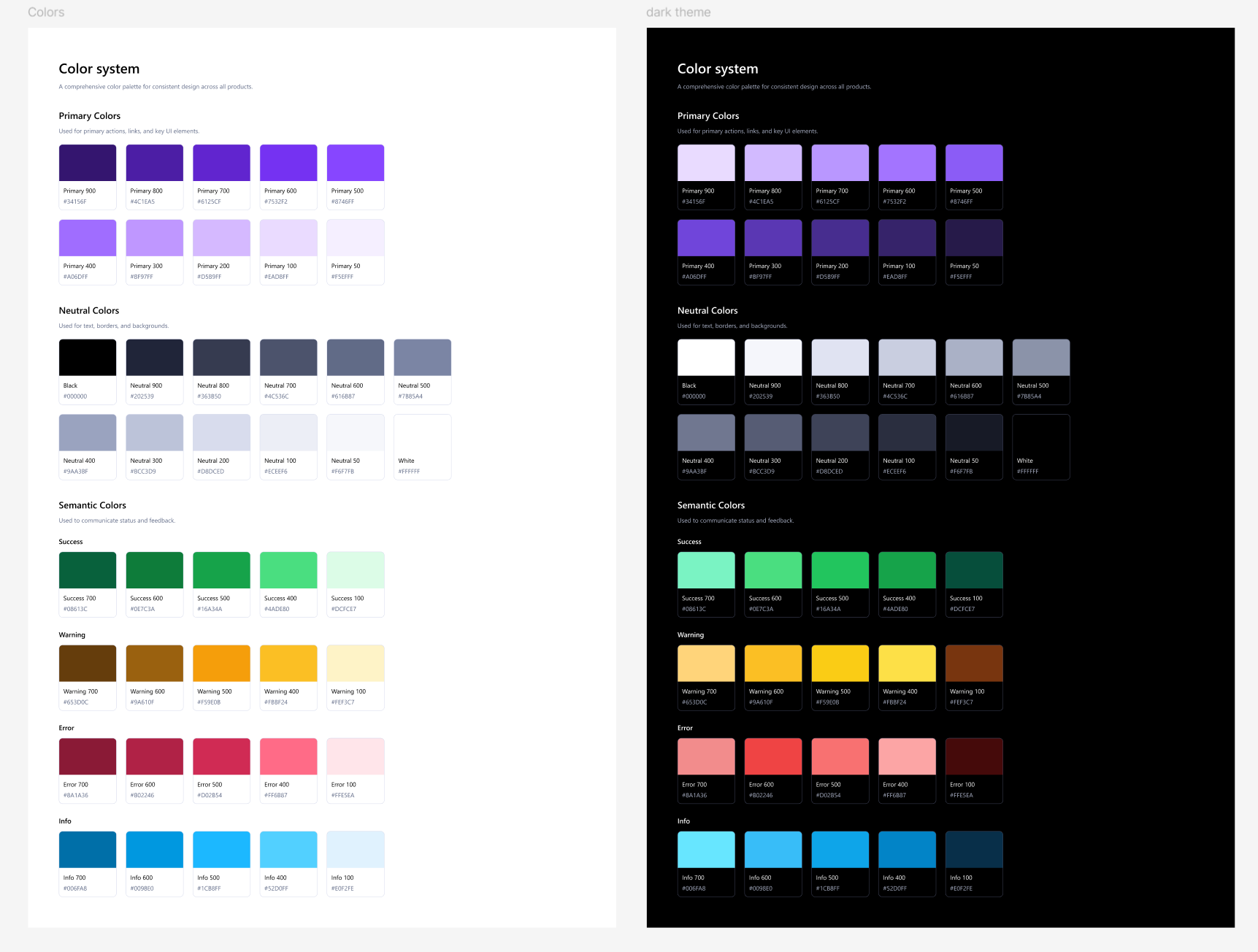
Root color scales
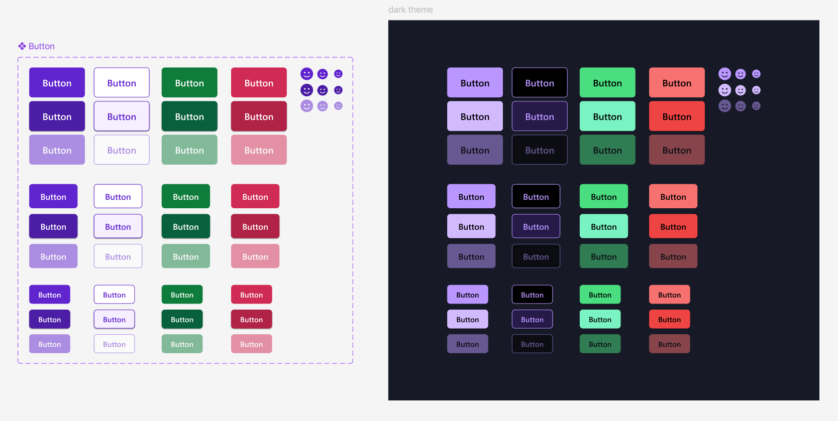
In scope: buttons, forms, alerts, cards, badges, and table — with variants and states, not a separate component for every size. Out of scope: a full app kit (modals, dropdowns, charts) and framework wrappers.
Button variants in Figma. Same names in CSS.
Open the Figma library or the example site to inspect states in the browser.
Dark and light share component CSS. Surfaces and text swap through semantic aliases.
One button component with size and style variants keeps Figma and CSS from drifting into four unrelated buttons.
Native stack for a method case: less brand theatre, faster load, focus on tokens and states.